About the Project
To better educate visitors, increase engagement, and drive leads, I redesigned parts of the Rehearsal corporate website utilizing web design trends and best practices.
Design
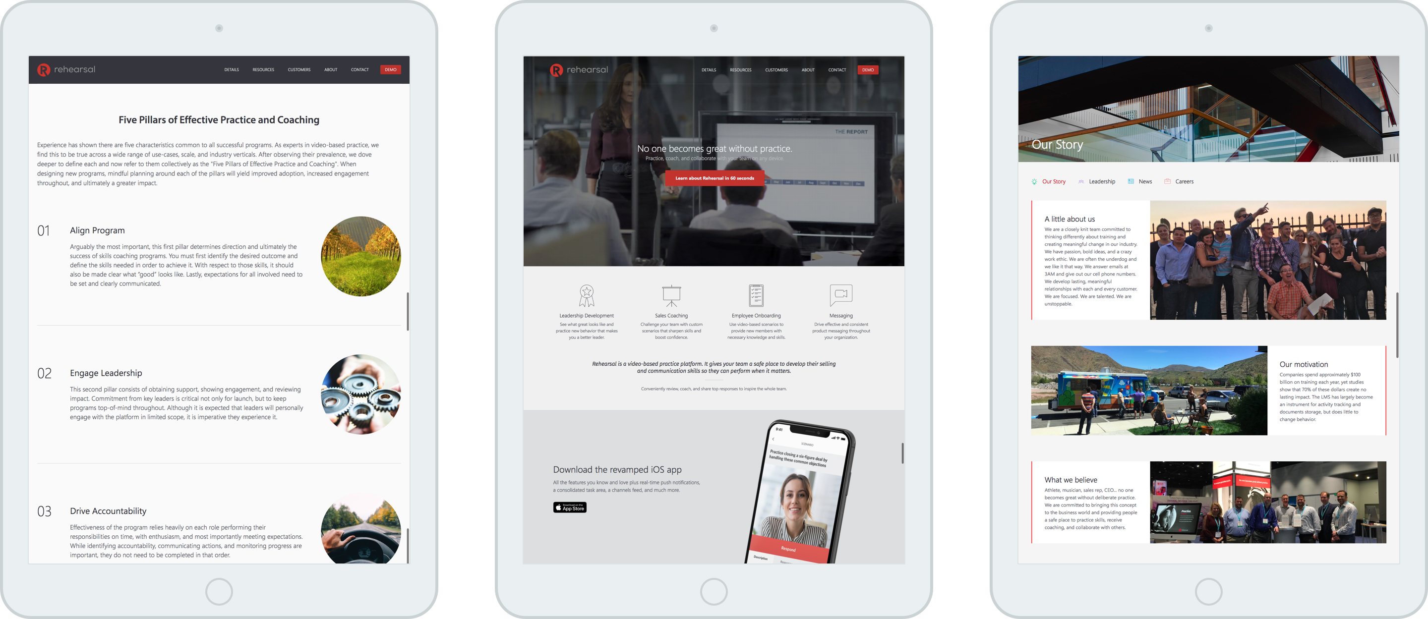
Since Rehearsal is a web app with many different use cases, it is not always obvious how it can apply to every individual visitor. I aimed to solve this problem by clearly spelling out our most common use cases under the main hero using both icons and text. I hope that the icons will catch the users' attention, and the short text snippets will keep their attention while quickly helping them understand how Rehearsal can help them.
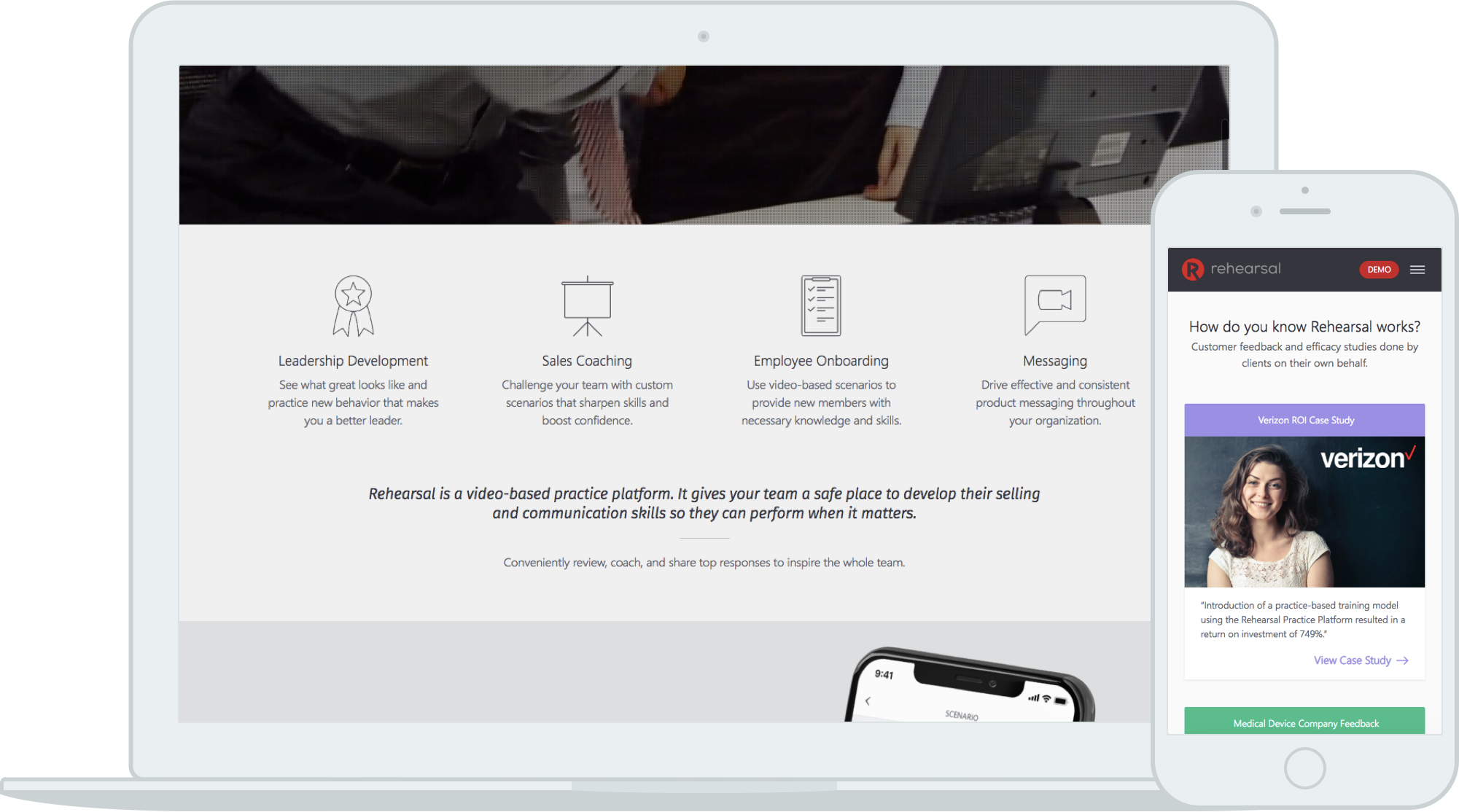
According to our analytics, the most clicked case study was only clicked 0.6% of the time. Since these studies are important for driving leads, visitors must notice and engage with them. Using faces, which psychology shows draw attention, and other engaging graphics, I aim to increase the case study click rate. I applied this same strategy and design to the video and case studies pages and am excited to see the results.
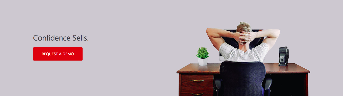
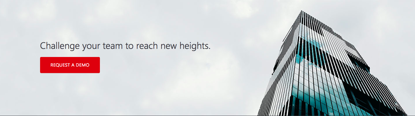
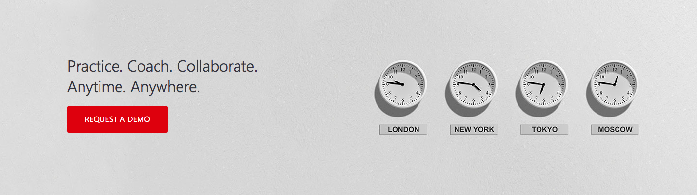
As I scrolled down the home page, I felt that I was left with no action once I reached the end. I wanted to provide another opportunity for users to fill out an interest form, so I designed a series of seven footers with one main call to action to place at the end of the home page. Even if just one user clicks this call to action, it is one more chance at a lead and possible sale for the company.