About the Project
Rehearsal is a software platform that helps companies improve the communication skills of their employees through virtual practice. Learners are assigned video-based prompts, and their recorded video responses are reviewed by mentors or with artificial intelligence.
As a product designer, it is my responsibility to design new features, improve existing features, and ensure any addition integrates seamlessly into the application. My role in each project varies; I am sometimes a designer, user researcher, usability tester, prototyper, or front-end developer. I love wearing many hats and approaching the product from many directions.
The contribution to the Rehearsal platform I am most excited about is my redesign of the Admin Review Tab and Conversation Thread. The admin review tab is where rehearsal mentors spend most of their time. This tab is where mentors view learner responses and leave feedback and grades for their learners, making this tab arguably the most important piece of the administrative product. Mentoring is a tedious task since each mentor has multiple learners responding to each scenario in a very similar way. The main goal of this redesign was to reduce as much friction as possible for mentors watching and responding to many learner responses.
Design
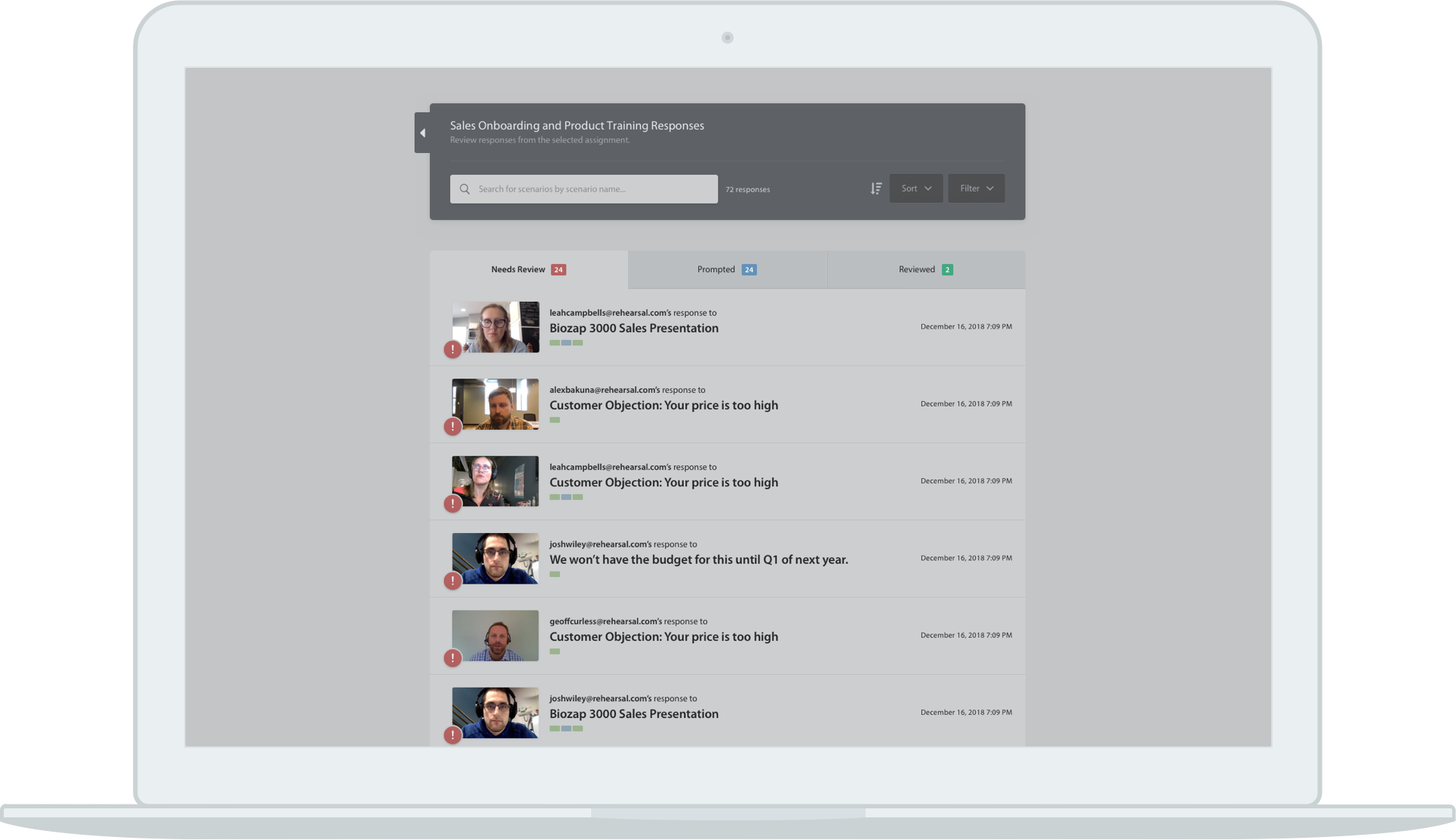
Currently, the review tab simply lists learner responses from newest to oldest with little to no organization. Additionally, when filters are applied to make the task more manageable, they disappear once the mentor enters a conversation and returns to the review tab.
The new design initially groups responses by assignment with an overall summary statement, giving the mentor important context and an idea of how much work they have left to do. After selecting an assignment, responses are displayed in three tabs - needs review, prompted, and reviewed, again making it clear what the mentor should do next.
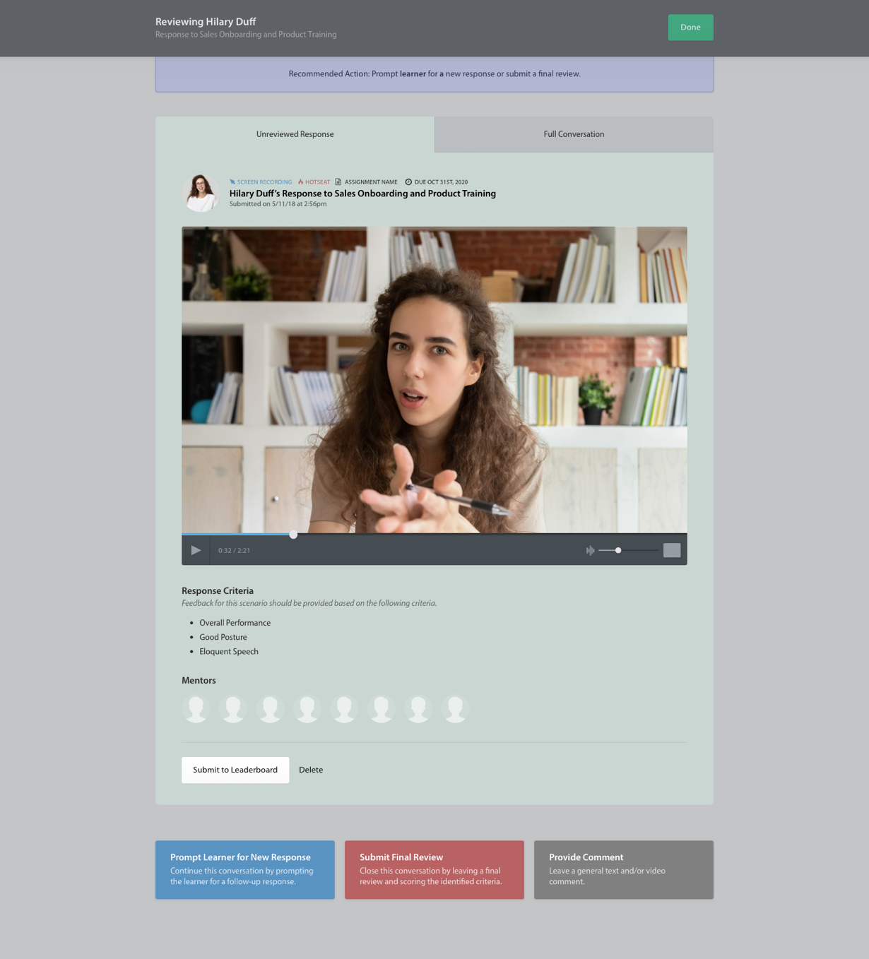
After selecting a response, the mentor is taken to a redesigned admin conversation thread. The new conversation thread is designed as a supermodal to ensure any sorting or filtering on the review tab persists. The learners' responses are the main focus of the conversation thread, while the scenario video the learners are responding to is hidden in a separate tab. Since the mentor is likely reviewing multiple responses to the same scenario, there is no need for the scenario video to be at the top of each thread as it is today.
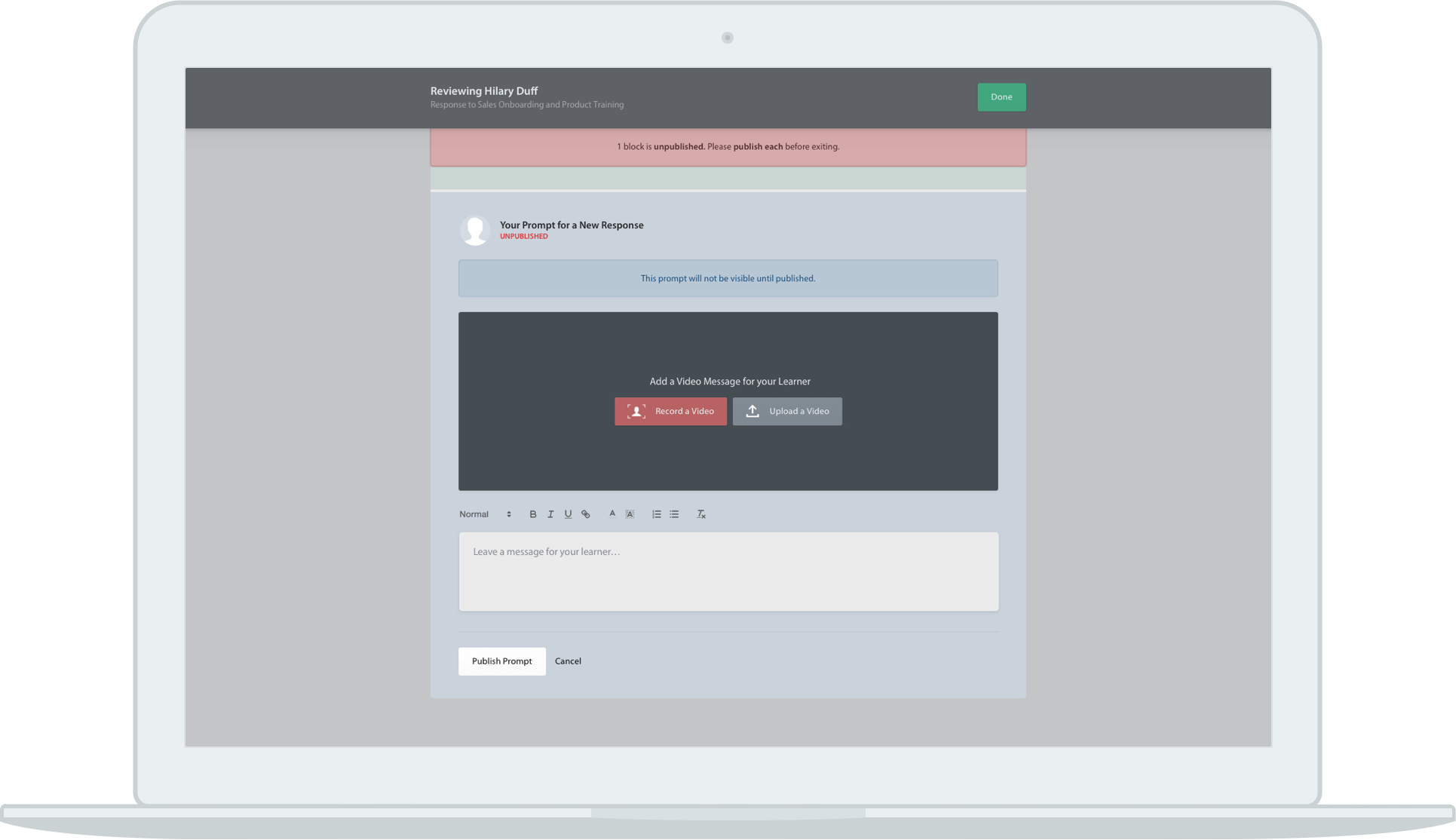
Previously, mentors would consistently type their feedback but forget to publish it. A bright, bold publish button and an additional warning message should make mentors more aware of the current publication status and the steps they should take to publish their responses.
Mentors have two options when leaving feedback: typing or recording a response. Previously, both response options were inline, giving them equal weight. Since the app encourages video responses from learners, we want to encourage mentors to respond with video as well. In the new design, the video option is above the text option, giving it greater weight.
Previously, there was confusion surrounding the difference between Comments, Prompts, and Feedback. Comments are a way to leave informal feedback that does not progress the conversation. Prompts require the learner to record another response and continue the conversation, and feedback is the official conclusion of the conversation. Since commenting is an action tied to individual responses and prompting and leaving feedback are tied to the conversation thread as a whole, I decided to display all three options in the same way in the same location to compare their purposes and intended uses better. Since commenting is the least recommended action, it is last, hopefully encouraging mentors to prompt and leave feedback for their learners.
Prototyping, Usability Testing, and Future
After completing the initial UX and visual designs, I created a high-fidelity prototype and usability test plan to test the designs with users internally and externally. The internal testing went smoothly with no resulting edits. During one external test, I received major pushback from a customer on a new design for the first time. A typical customer has anywhere from 50-200 learners in the system. This unhappy customer only has about 5-10 learners in the system at any time. While this redesign may make his job a bit tougher, we are designing for the common user, not the fringe one. The rest of the external tests went well with minor resulting edits. This redesign has not moved into development yet due to business goals, but when the time comes, I will do the HTML, CSS and some demo Javascript before handing it off to an front-end developer.