About the Project
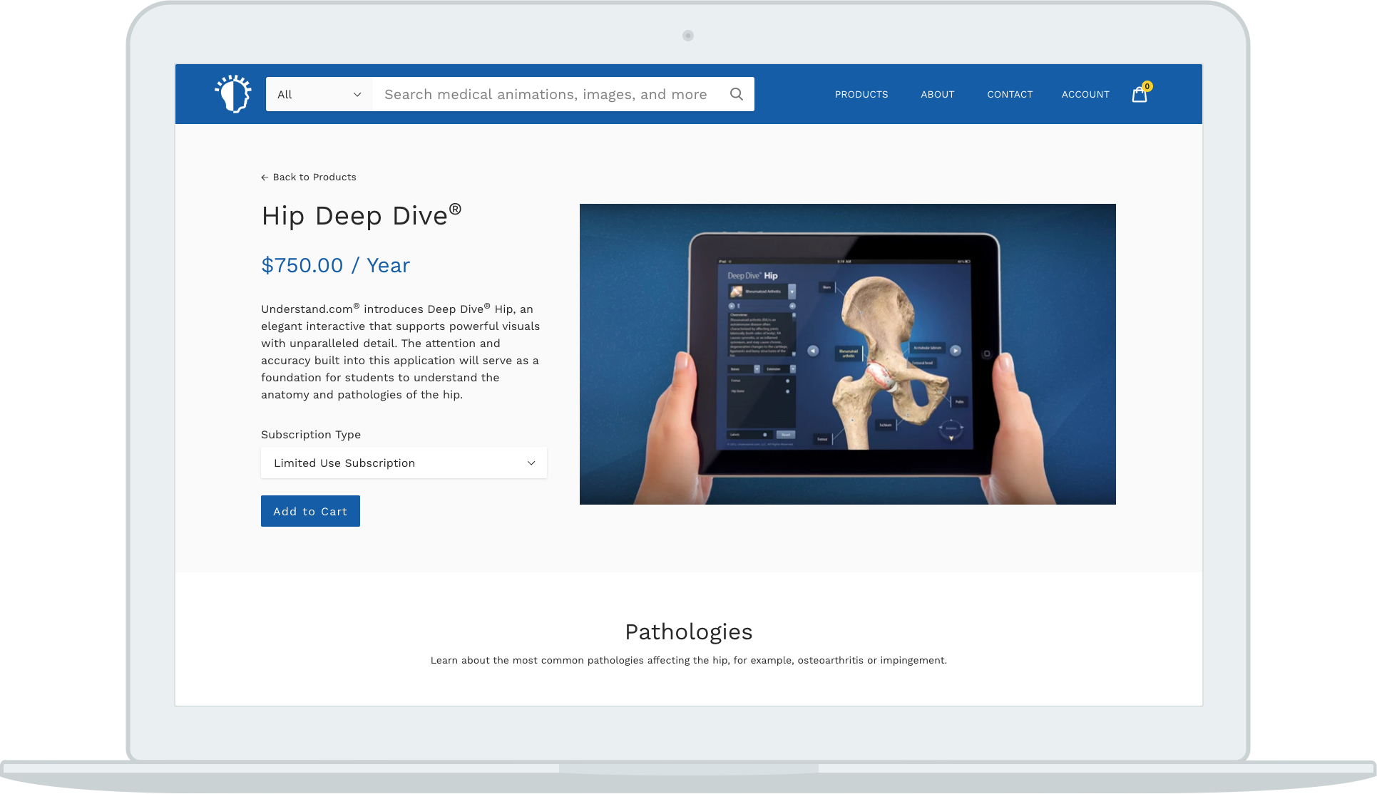
In the past, Understand has licensed medical animation libraries and interactive deep dives to medical professionals around the world. When Understand decided to add single animations and images to the product offering they needed a new site and webstore. As an animation and illustration company, Understand has a lot of visual content to proudly showcase therefore the goals of the redesign were:
- Minimalistic, simple design with neutral colors and space between elements
- Show the breadth of products in a way that is not overwhelming and is easy to consume
- Get users to products of interest quickly
- Increased ease of use and better overall user experience
- Smooth checkout so as not to hinder sales
Design
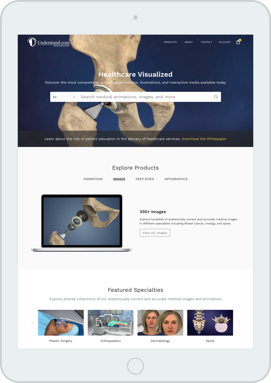
I wanted the process of finding an asset and purchasing it to be as seamless as possible. To facilitate this, there is a large focal search bar on the home page for users who know exactly what they are looking for. This prominent search is the most efficient and effective way to allow users easy access to the broad product catalog. Below are sections that encourage exploration for users who find themselves on the site without an exact goal.

The checkout process is an incredibly important part of the users' experience and it was imperative to me that the checkout experience is as painless as possible. A status indicator is placed at the top of each step so users know exactly where they are, what they have done, and what they have left to do. The order details are also displayed at every step so that users are not forced to leave the checkout to double-check their carts and can proceed without questions. Finally, a review tab is included in the process so users can ensure all of their details and items to be purchased are correct before submitting their payment details.
My favorite part of the site is the product dropdown menu. It serves to categorize the most important products and provide access to all products offered in the store. When Understand partnered with Blausen, this menu had to be redesigned to accommodate all of Understand's new product offerings. I found it so difficult to design away from something I loved so much, and in the end, I loved the new version just as much (if not more) than the previous one.

Development
When users reach the site, what they see is a highly customized Shopify theme, as well as custom React apps for search and checkout. I wrote most of the HTML, CSS, javascript, and React code, and I could not be prouder or more thrilled.
Post Launch Testing and Pain Points
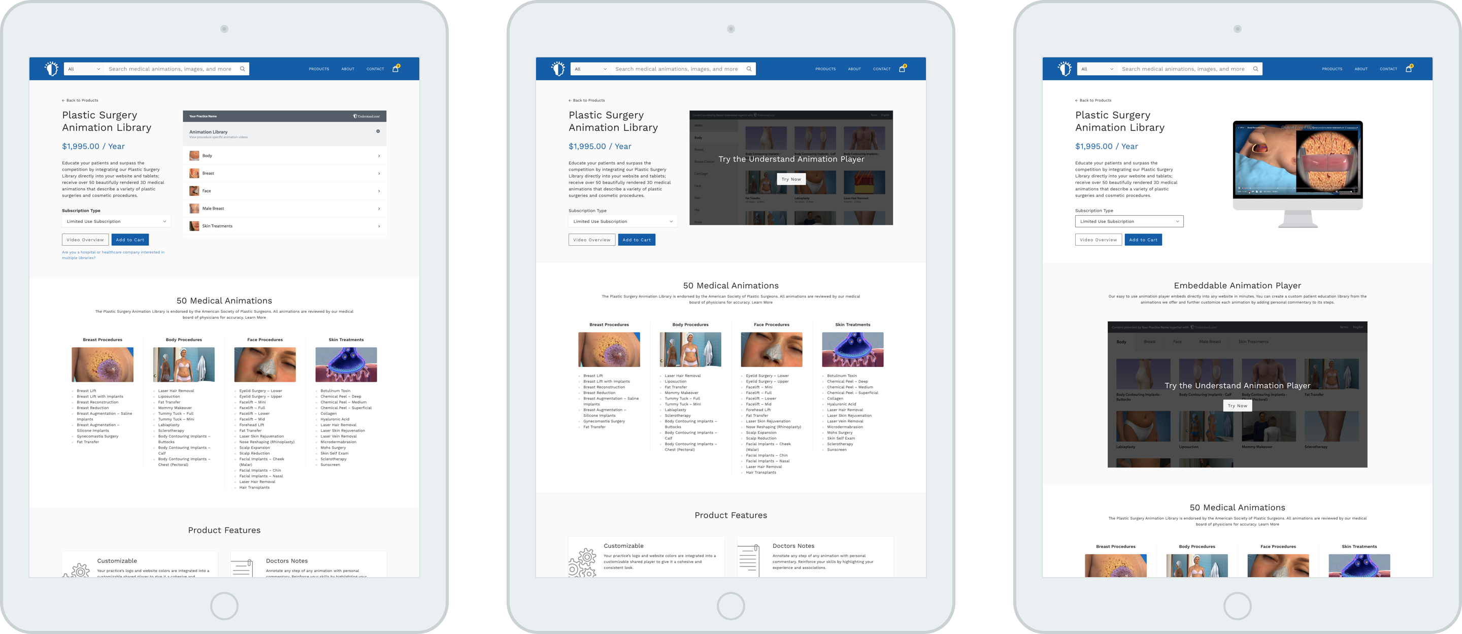
Studying user interactions revealed that users were scrolling less than 40% on product pages. When casually showing some friends the site and asking why they hadn't scrolled, I realized that most people didn't know there was more on the page than just the initial product introduction at the top. Studying user interactions also revealed that people were not interacting with the product demo as much as expected. With this information, I decided to run some A/B tests focusing on ways to encourage scrolling and increase interaction with the animation player.
30% of users shown version A scrolled down the page and 30% clicked into the product demo while 100% of users shown version B scrolled and 66% clicked into the product demo. Overall, version B was most successful in achieving our outlined goals. My next steps will be to run a similar test with a more representative group of users, including doctors, medical staff, and medical students, to gather more conclusive evidence and finally redesign the animation library product pages.
